Make a nice-looking barplot.
make_barplots(data, column, count = TRUE, title = NULL, ylab = NULL)Arguments
- data
A data.frame with the data you want to graph.
- column
A string with the name of the column you want to make the plot from.
- count
A boolean (default TRUE) indicating if you want the barplot to show a count of the column values or a percent.
- title
A string with the text you want as the title.
- ylab
A string with the text you want as the y-axis label.
Value
A barplot object.
Examples
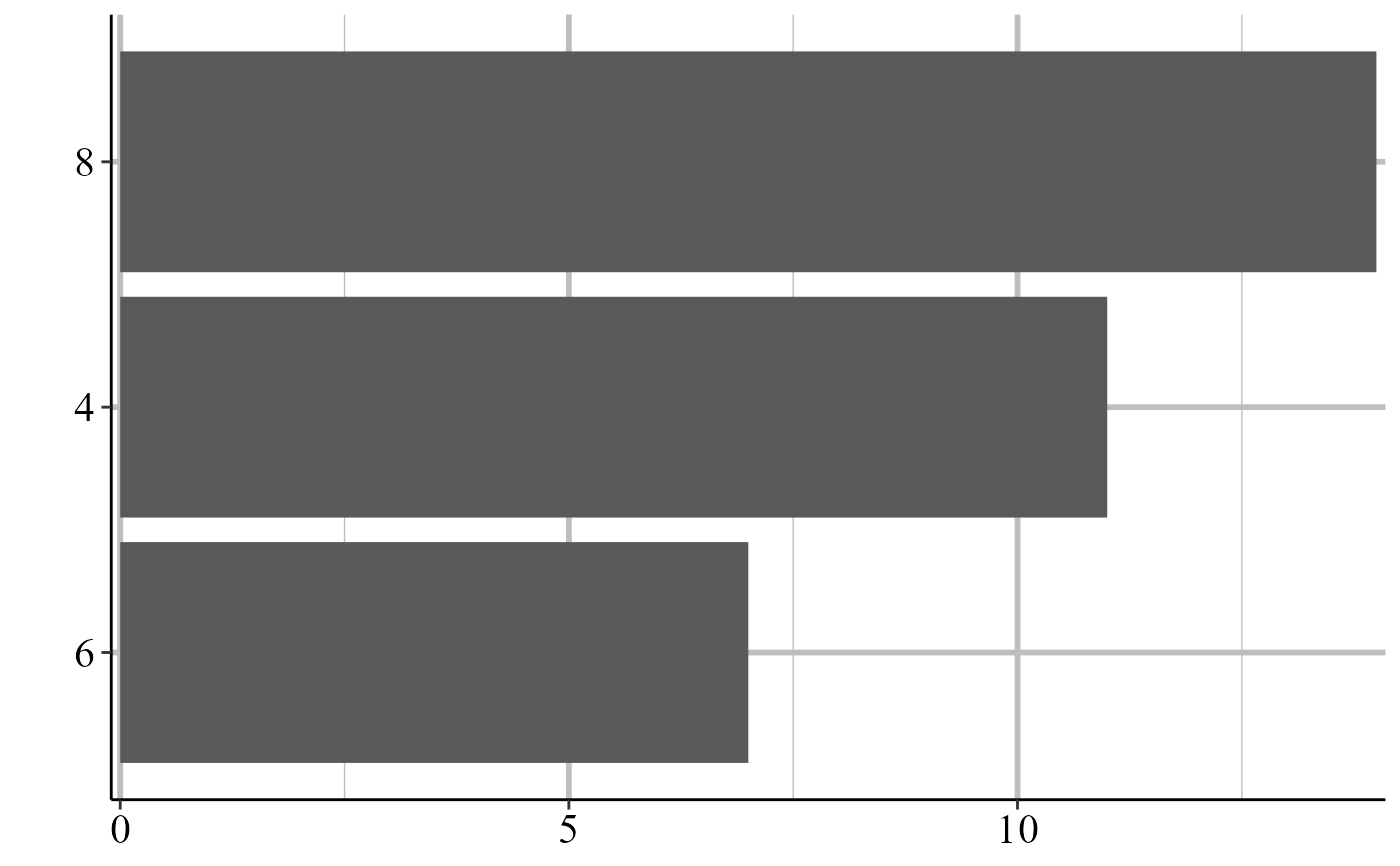
make_barplots(mtcars, "cyl")
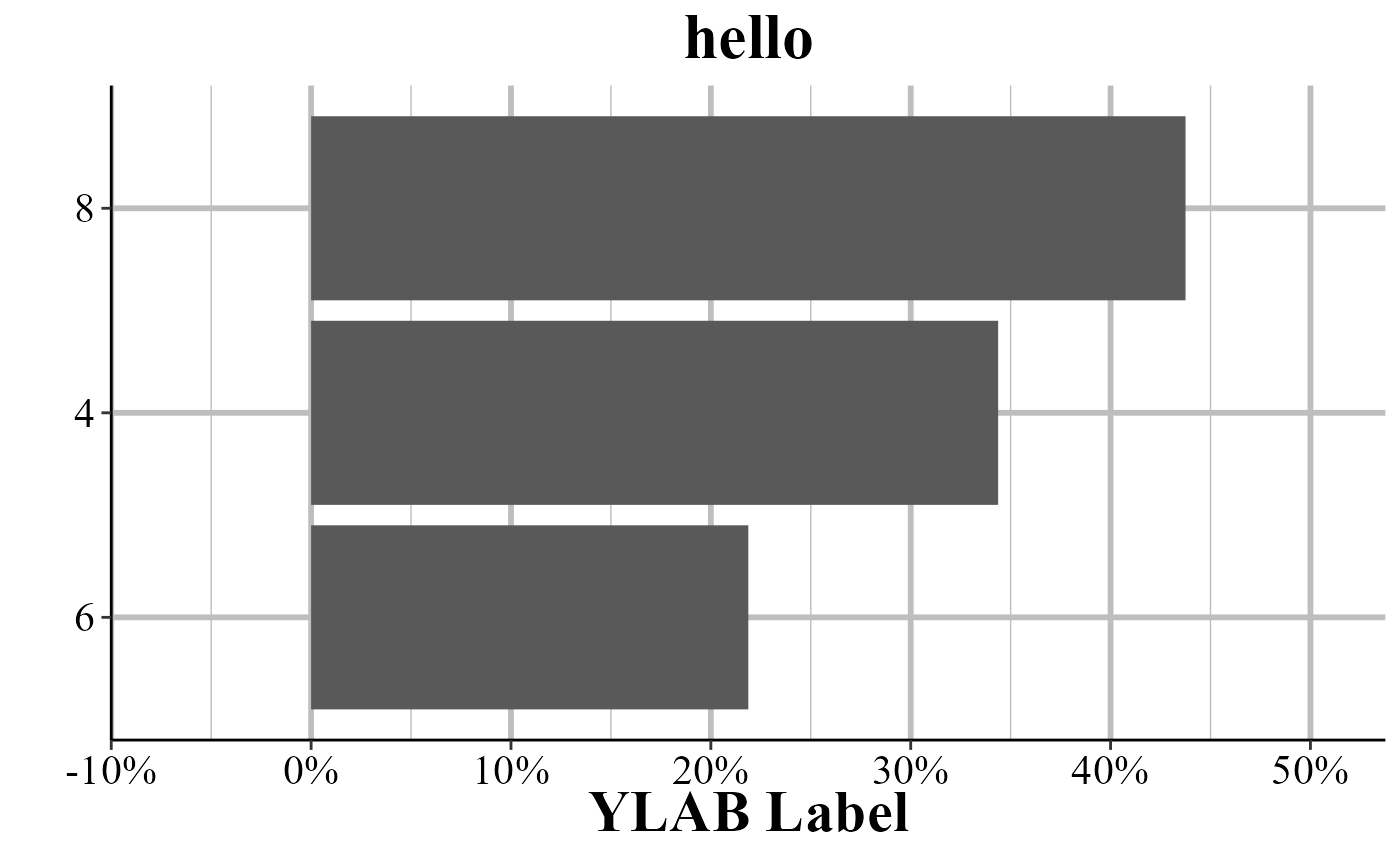
 make_barplots(mtcars, "cyl", count = FALSE, title = "hello", ylab = "YLAB Label")
#> Warning: The dot-dot notation (`..count..`) was deprecated in ggplot2 3.4.0.
#> ℹ Please use `after_stat(count)` instead.
#> ℹ The deprecated feature was likely used in the crimeutils package.
#> Please report the issue at <https://github.com/jacobkap/crimeutils/issues/>.
make_barplots(mtcars, "cyl", count = FALSE, title = "hello", ylab = "YLAB Label")
#> Warning: The dot-dot notation (`..count..`) was deprecated in ggplot2 3.4.0.
#> ℹ Please use `after_stat(count)` instead.
#> ℹ The deprecated feature was likely used in the crimeutils package.
#> Please report the issue at <https://github.com/jacobkap/crimeutils/issues/>.