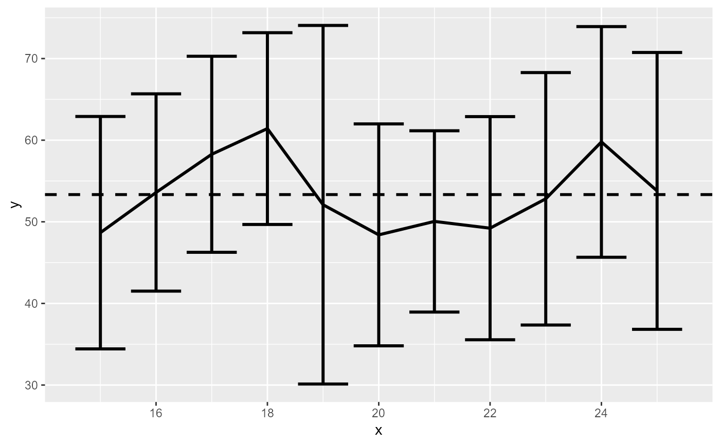
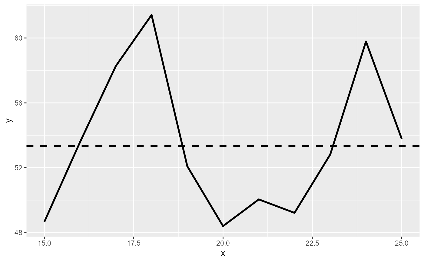
Create a line graph with 95% confidence interval bars
make_average_graph(
  data,
  x_col,
  y_col,
  confidence_interval_error_bars = TRUE,
  mean_line = TRUE,
  type = c("line", "bar")
)
Arguments
- data
A data.frame with the data you want to graph
- x_col
A string with the name of the x-axis column
- y_col
A string with the name of the y-axis column
- confidence_interval_error_bars
A boolean (default TRUE) for whether to include 95% confidence intervals or not.
- mean_line
If TRUE (default) willadd a dashed line with the overall mean.
- type
A string for whether it should make a linegraph ("line", default) or a bargraph ("bar")
Value
A ggplot object. Also prints the graph to the Plots panel.
Examples
data = data.frame(x = sample(15:25, size = 200, replace = TRUE),
y = sample(1:100, size = 200, replace = TRUE))
make_average_graph(data, "x", "y")

make_average_graph(data, "x", "y", confidence_interval_error_bars  = FALSE)

make_average_graph(data, "x", "y", type = "bar", mean_line = FALSE)

make_average_graph(data, "x", "y", confidence_interval_error_bars  = FALSE, type = "bar")
